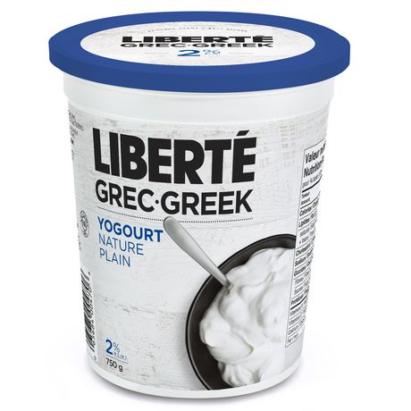
Ever since Prime Minister Pierre Trudeau initiated the official bilingual policy at the federal level in 1971, products sold in Canada of all sorts have been required to display all text in both English and French, regardless of where they will be sold. That goes for nutritional information; it goes for ingredients; it goes for any advertising slogans—in a word, tout. With the limited amount of usable surface space on any given product, advertisers and packaging designers have had to muster up no small measure of ingenuity in order to meet the federal requirements. One of the most cited examples is yogurt. While English Canadians generally write 'yogurt' and French Canadians write 'yoghourt', Canadian dairy companies tend to label the product, 'yogourt,' which is a less used but acceptable spelling in both languages.
Design strategies to meet the requirement range from patently clever to awkwardly wordy to downright embarrassing. Normally, the only solution is to present text in both language, but quite frequently designers attempt some form of compromise, as in the case of yog/h/o/urt.
Here's a typical example from a bottle of shampoo/shampooing:
5 problems, 1 solution. Or, in French, 5 problèmes, 1 solution. It's a bit ugly to an English speaker (what's up with the extra E, eh?), but it works okay in French because French speakers are pretty accustomed to seeing letters in parentheses; French grammatical rules regarding gender agreement mean you'll often see things like: "es-tu content(e)?" or "chaque étudiant(e)." Also, accents are typically not necessary on capital letters, so the designer was able to avoid the grave accent (`) on the first E by simply using capital letters. In sum, the designer found 1 solution to about 5 problems.
This series of blog posts is my modest attempt to track and highlight the best and the worst of product designers' attempts to create products that are attractive and that meet the language requirements. The Sleek, the Chic and the Linguistique, if you will. Tune in next time to learn about bilingual product design strategies on that most quintessentially Canadian of products, maple syrup.

 I was recently interviewed on H-Net Haiti about my new English translation of an old Haitian novel. Fernand Hibbert's Les Simulacres was published in 1923 during the United States' Occupation of Haiti. It's a comedic and poignant look at the pretensions of powerful nations from the perspective of the underdeveloped world. A classic of Haitian literature, is is still studied and enjoyed in the country today. My translation, Pretenders, contains valuable insights for ongoing issues of sovereignty and development in Haiti.